mOre space
Client
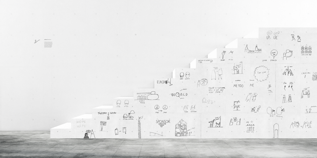
In a strict sense, mOre is a hub in Kiev, Ukraine. It hosts events, workshops, and studios. Generally speaking, mOre is beyond all classic formats. This is the place where great ideas are born, new meanings are formed, modern and timely cultural projects are created. A place where the power of creative group thinking reaches its peak and the quantity goes into quality. The key thing about mOre is that it will host great debates, with well-formed ideas about business, innovations, social and cultural changes.
Challenge
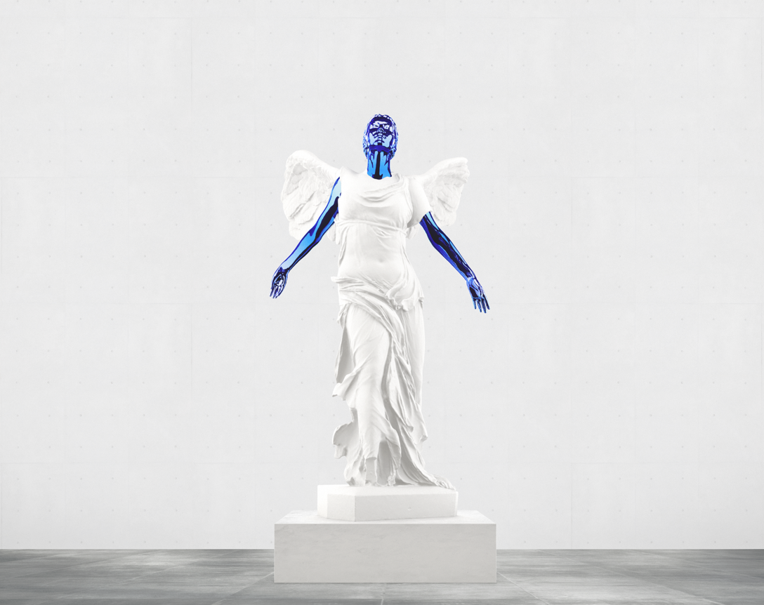
By this synopsis, we were asked to create meaningful branding. Our goal was to start conversations and make people curious about this space. Our approach was to make people view mOre as a birth point for ideas, movements, and cultural trends.
Concept
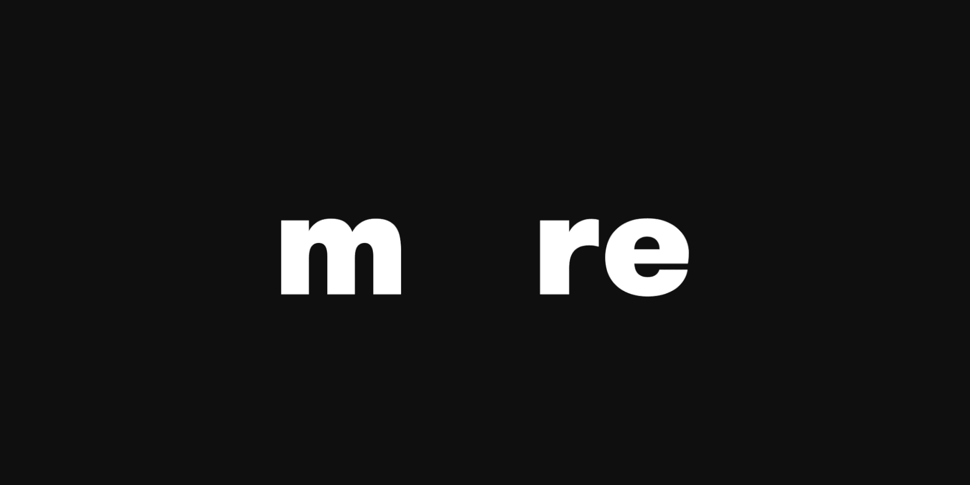
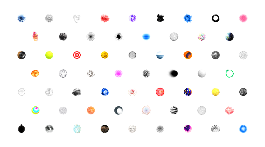
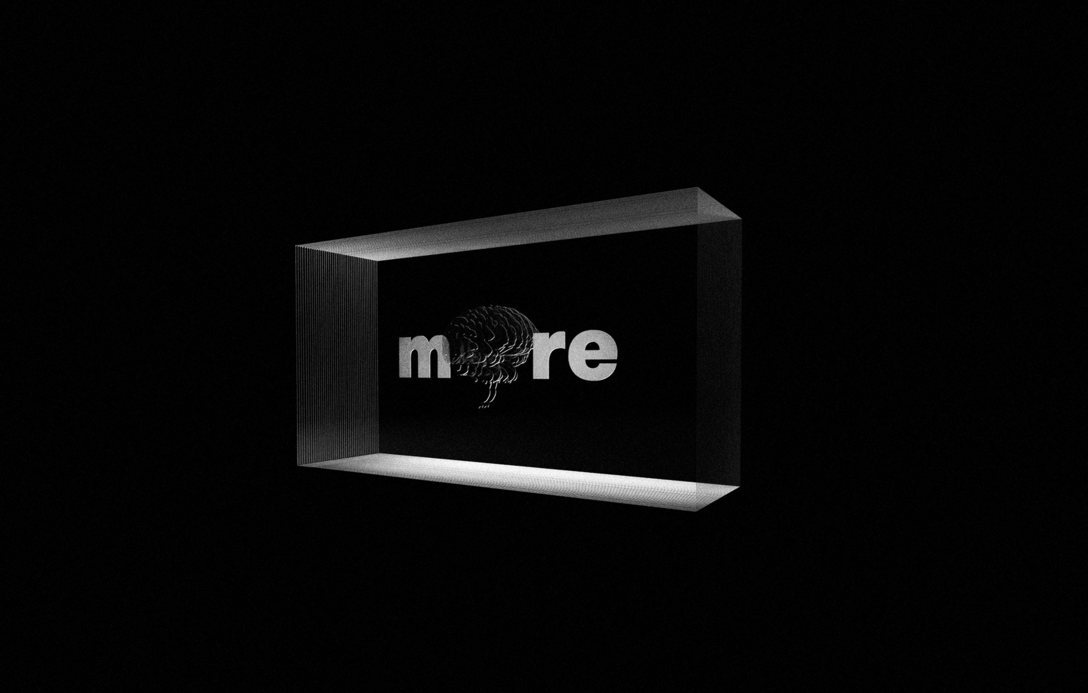
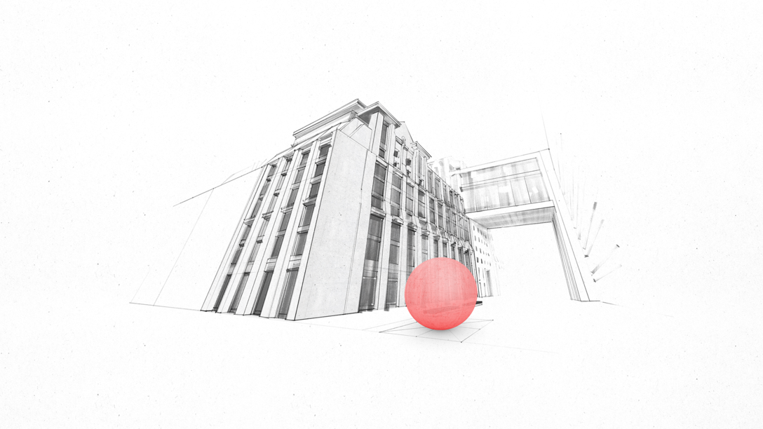
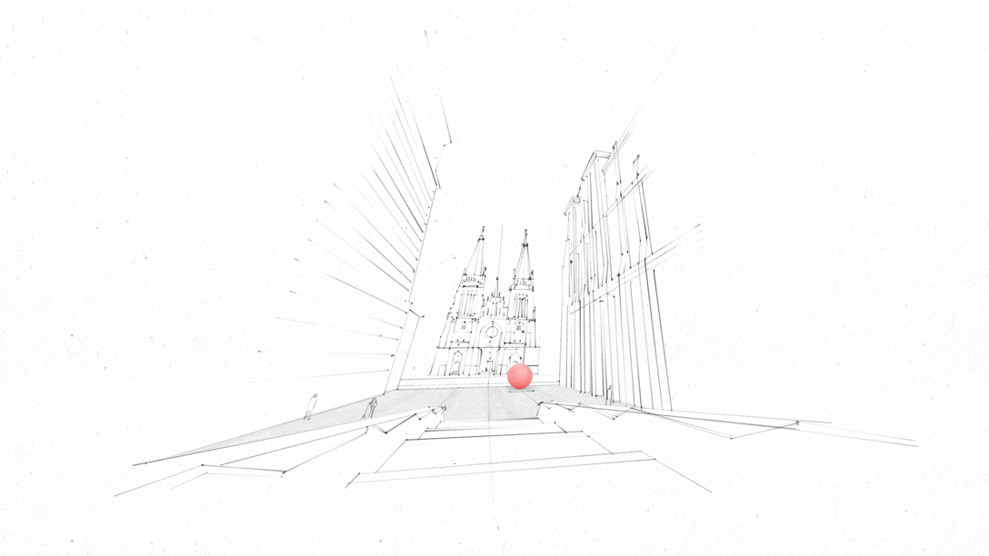
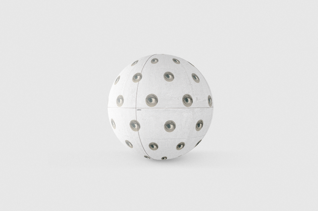
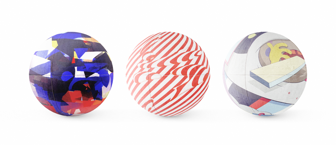
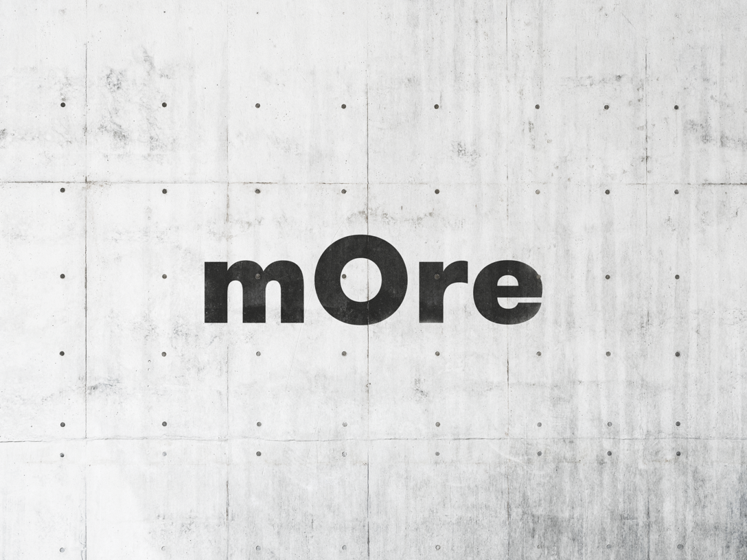
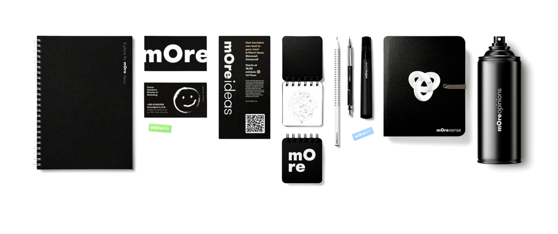
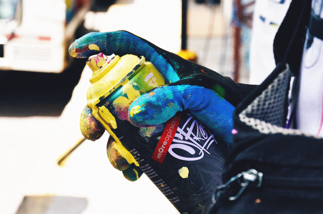
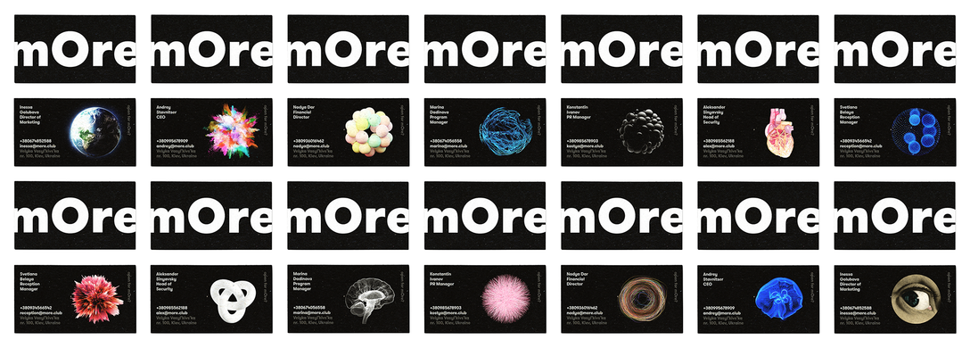
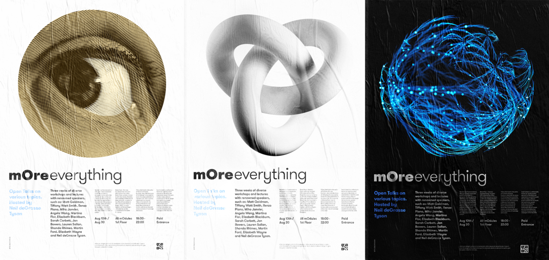
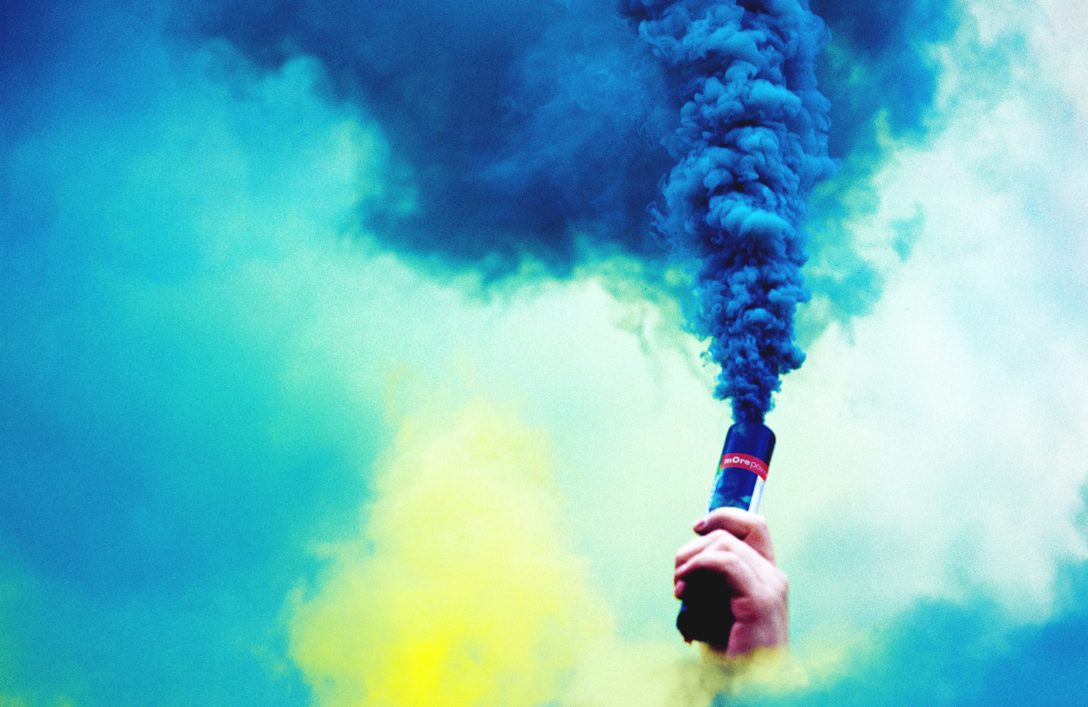
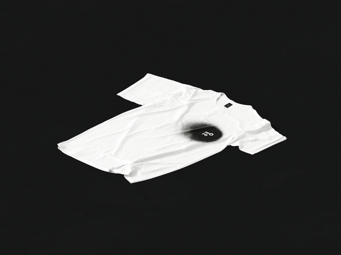
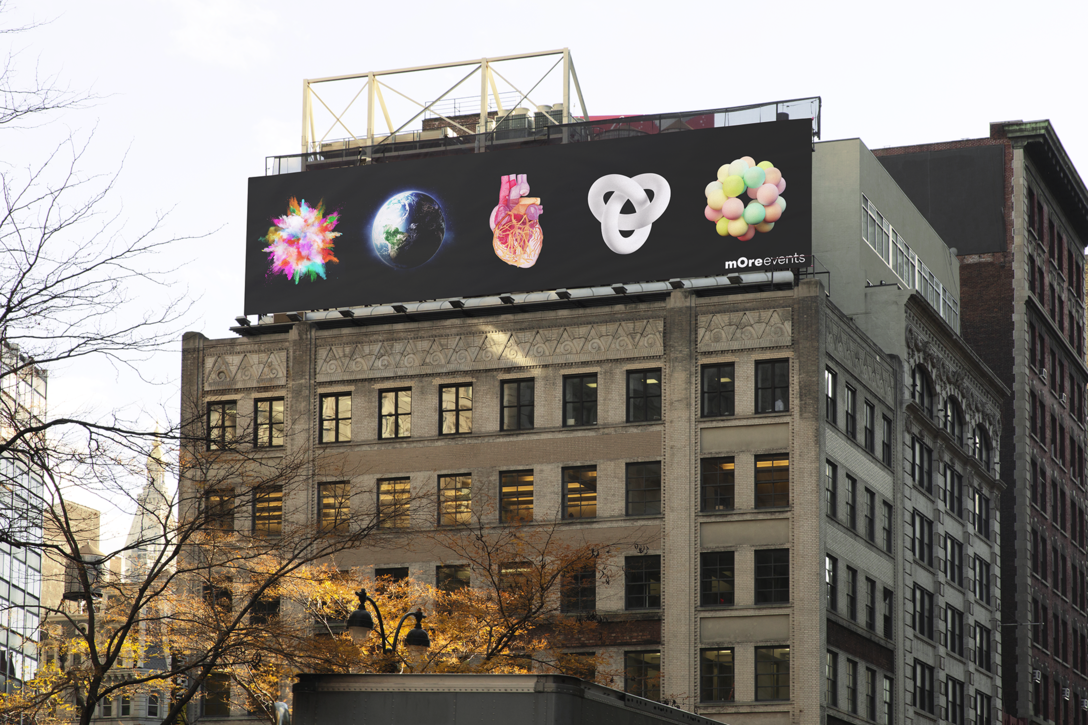
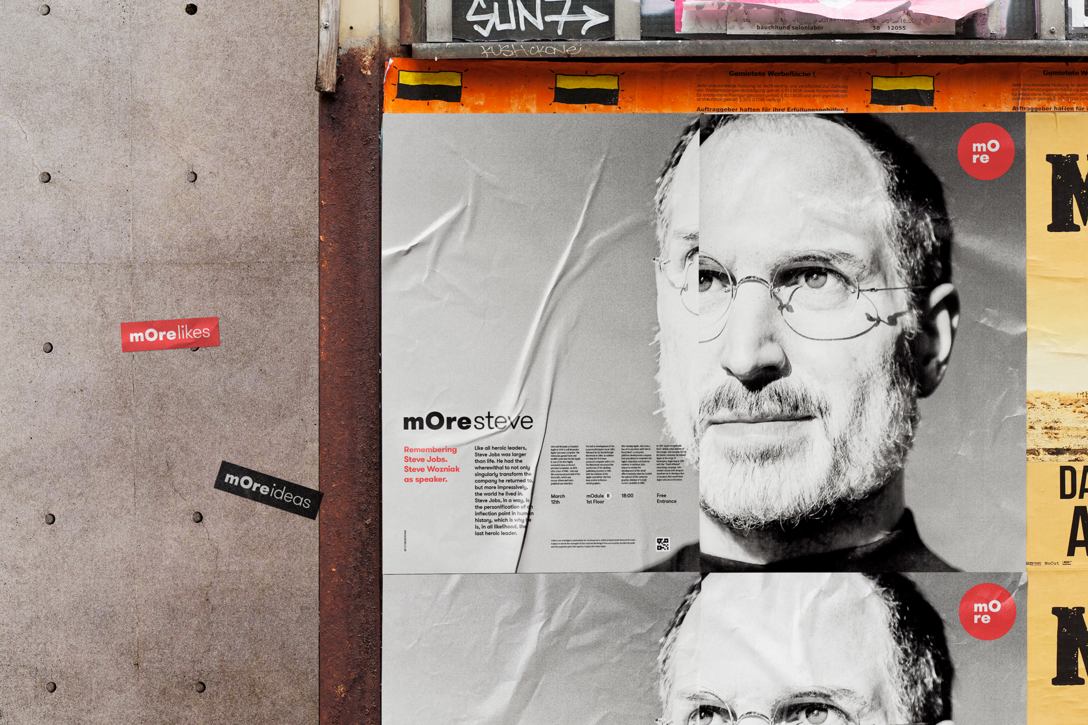
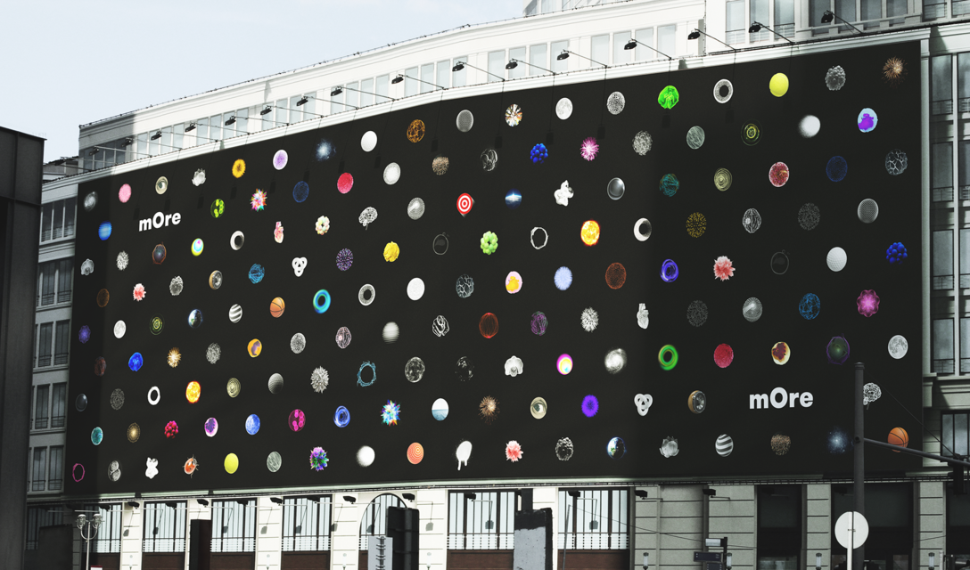
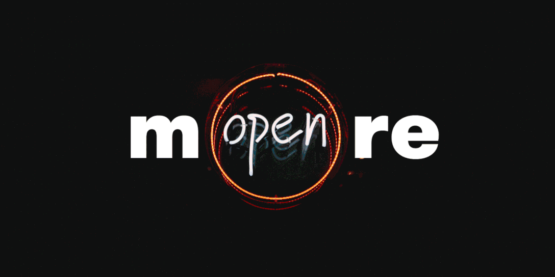
To transmit the main idea and purpose of mOre hub, we used the circle icon, because of its deep meanings and philosophy. The circle is one of man’s first symbols. It is inclusive. It invites people to come together and be united. It is accepting and protective. It sparks creativity and enlightens people. That's why, the 'O' from mOre is treated graphically to suggest the main theme of any event, thus becoming flexible and vibrant. The branding is left with open-ending to always be relevant to the actual debates, ideas, trends, politics, innovations etc. It will continuously generate different visuals to replace the O icon, depending on the context. The brand we created is described as constantly evolving.


![]()
此文章仅用于学习交流使用,不涉及任何版权、知识产权问题,如有疑问请联系我们。
那些依靠改变繁荣发展的企业——在于品牌设计。